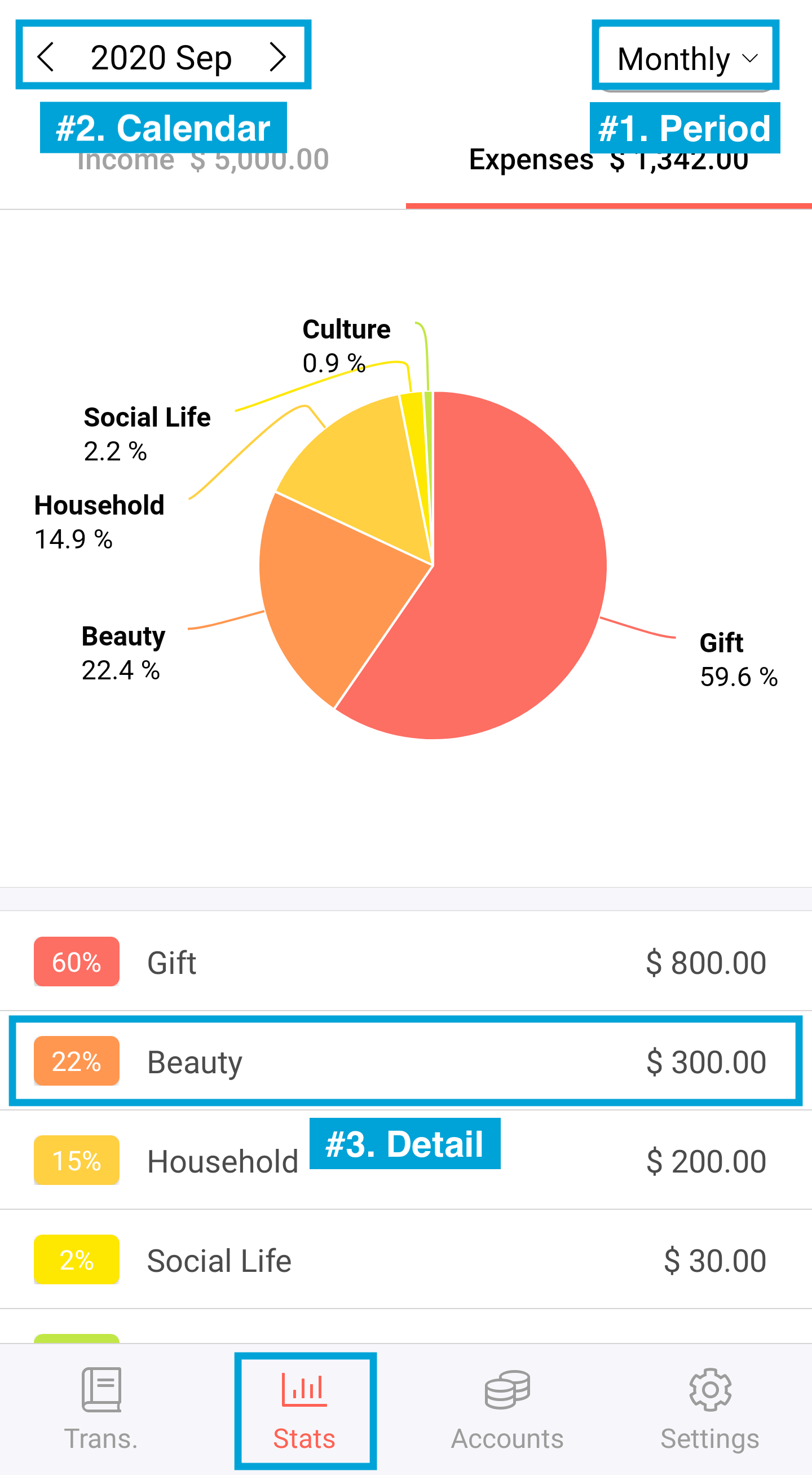
The Stats chart is divided into categories of income/expenses you have recorded.
It helps you to capture your income/spending patterns.
You can also check the occupancy of those categories in ratio terms.
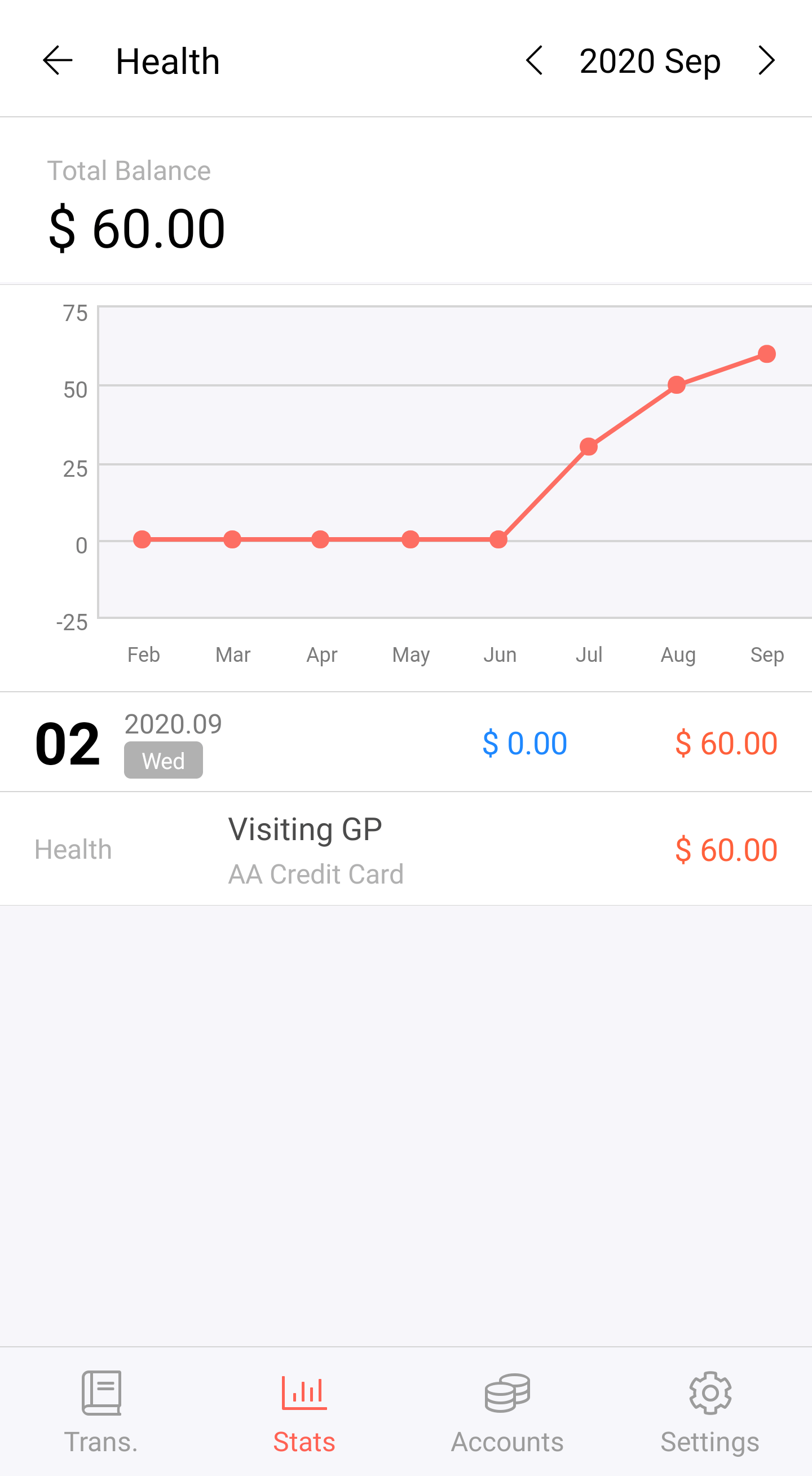
Tab the category from the pie chart to see the total amount and the monthly pattern.

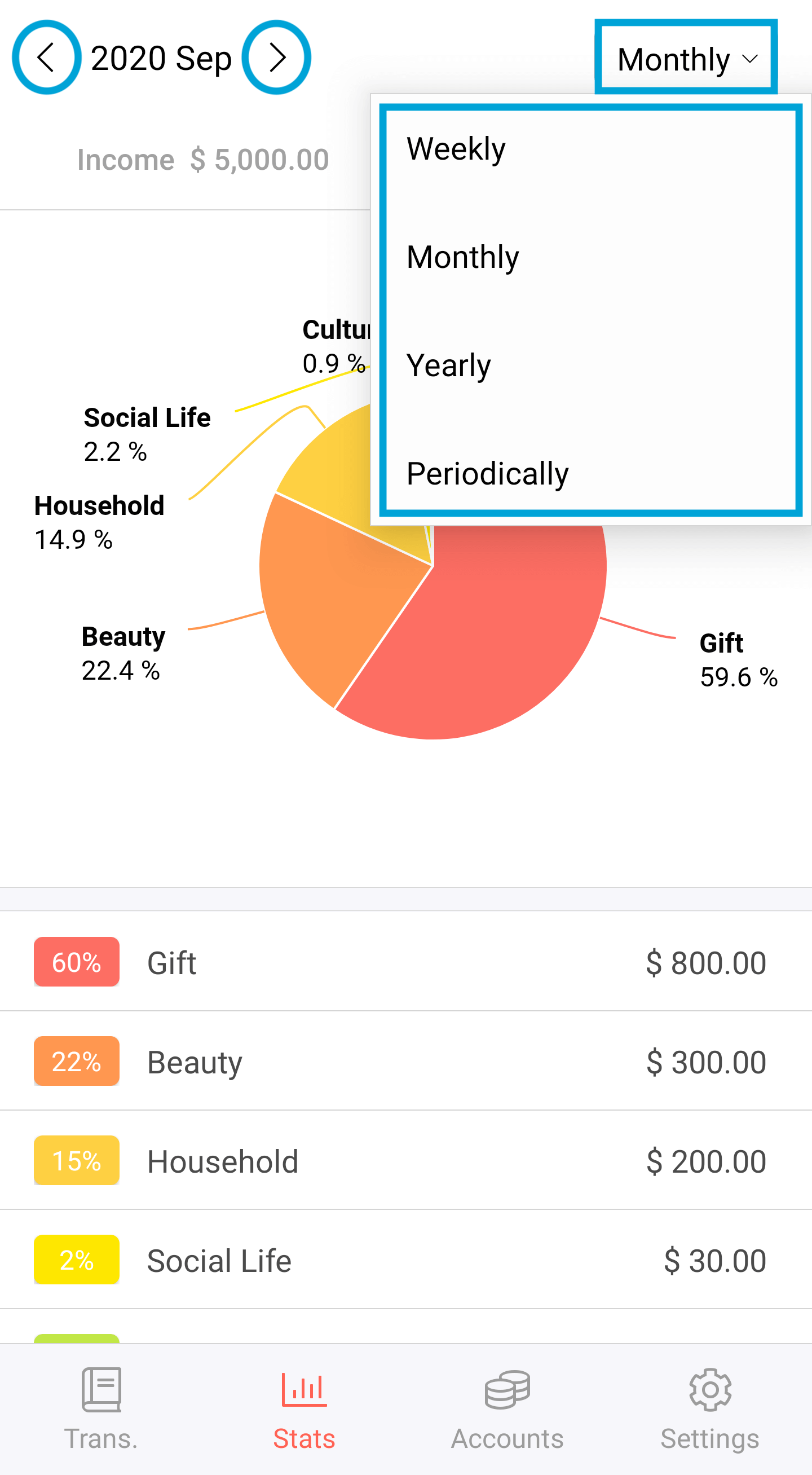
1. The default setting is Monthly view. Tap "Monthly" and choose not only the period but also "List" or "Trend" from the drop-down menu. You can change the time-period settings.
2. You can also use < and > buttons to check your expense by calendar months.

3. The page starts off with a pie chart. You can find your spendings by the categories that you have recorded.
If you want to see more detail, tap the one on the list below the pie chart.

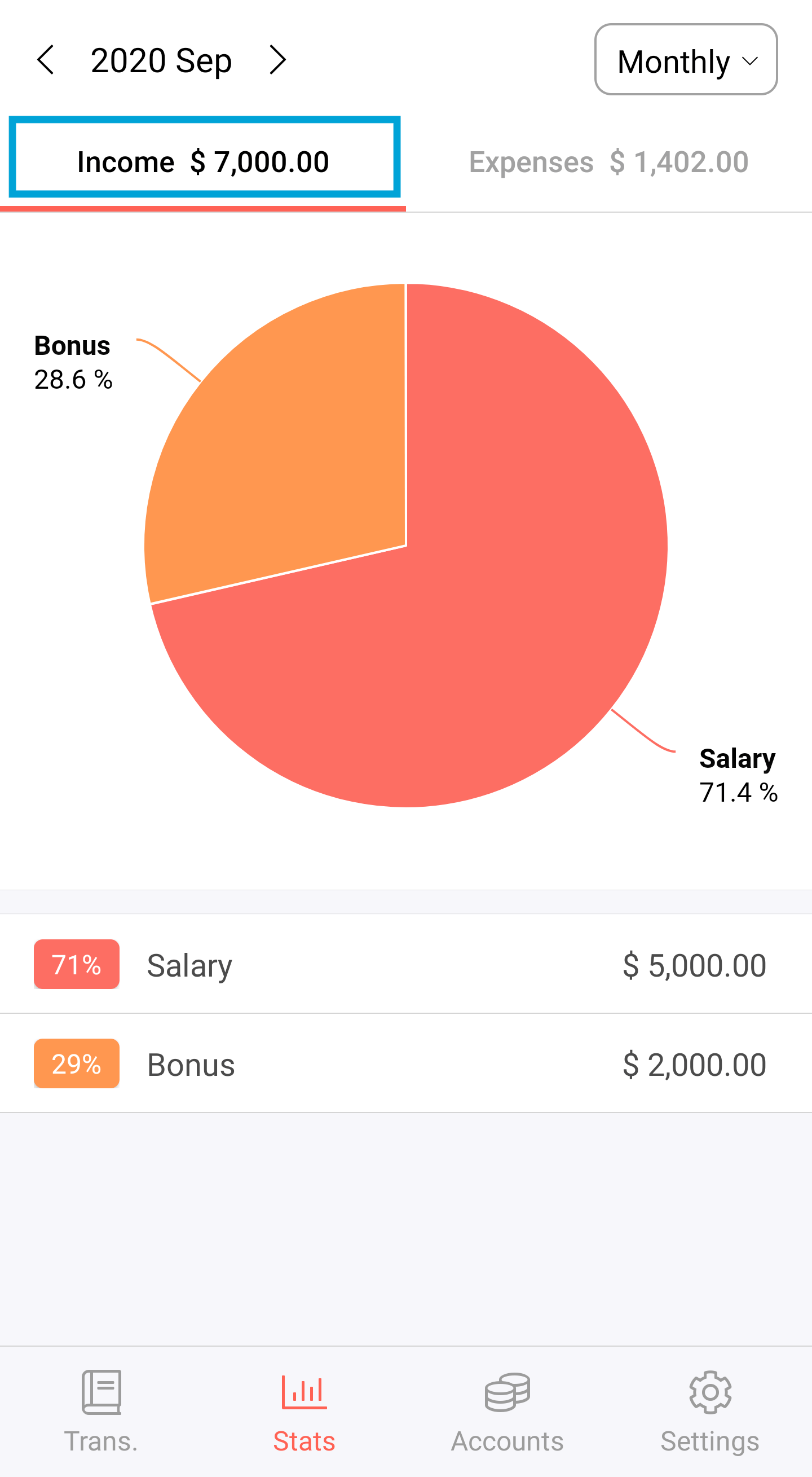
4. You can review your income stats just like expenses.

